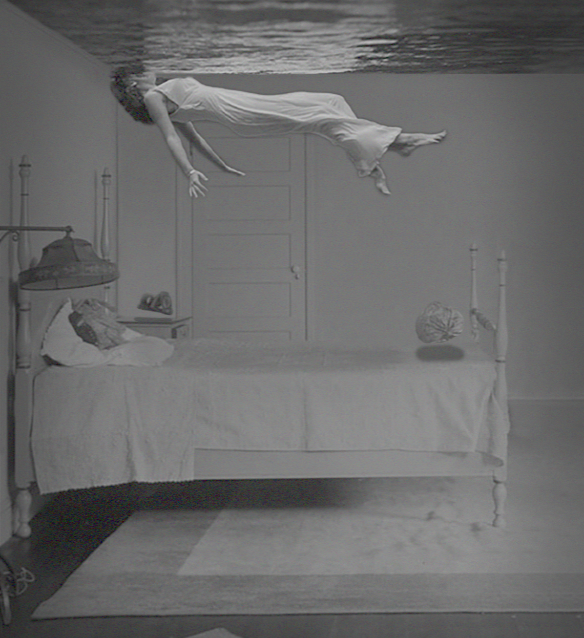
"Reclamation Nights" was one image in a batch of several I showed to the editors of Bear Review a year before this issue was published. They loved this image and wanted for a cover, but it didn't exactly fit the nature of the poetry in issue 9.2, so they decided to push it back to 10.1. This began as a personal project and ended up being one of my most loved covers for Bear Review.
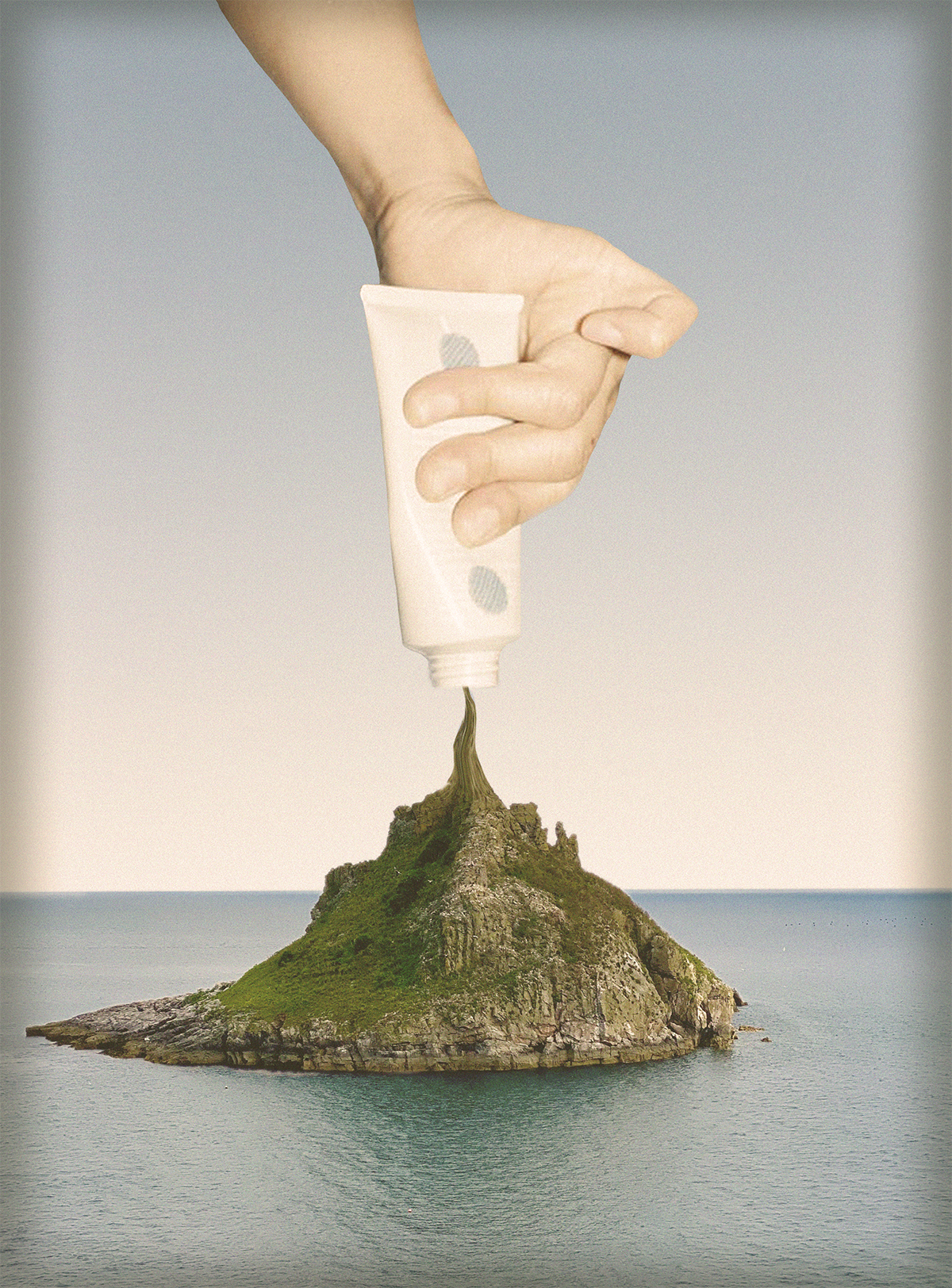
Another personal project-turned-cover for Bear Review. This was another one in the previously mentioned batch I showed to the editors; they decided to take this one for issue 9.2. I saw a 1950s promotional poster or advertisement with a condiment, and I wanted to see if I could recreate it in my own style. And toothpaste, of course.
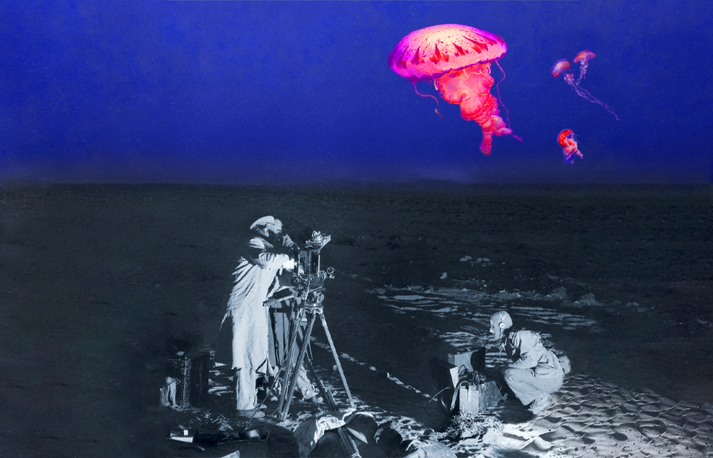
"The Study" was formerly the masthead image for my website. The editors for Bear Review asked for the image to be their cover, and I couldn't resist. This image is very much in my realistic surrealism aesthetic style, and I quite enjoy how it came out.
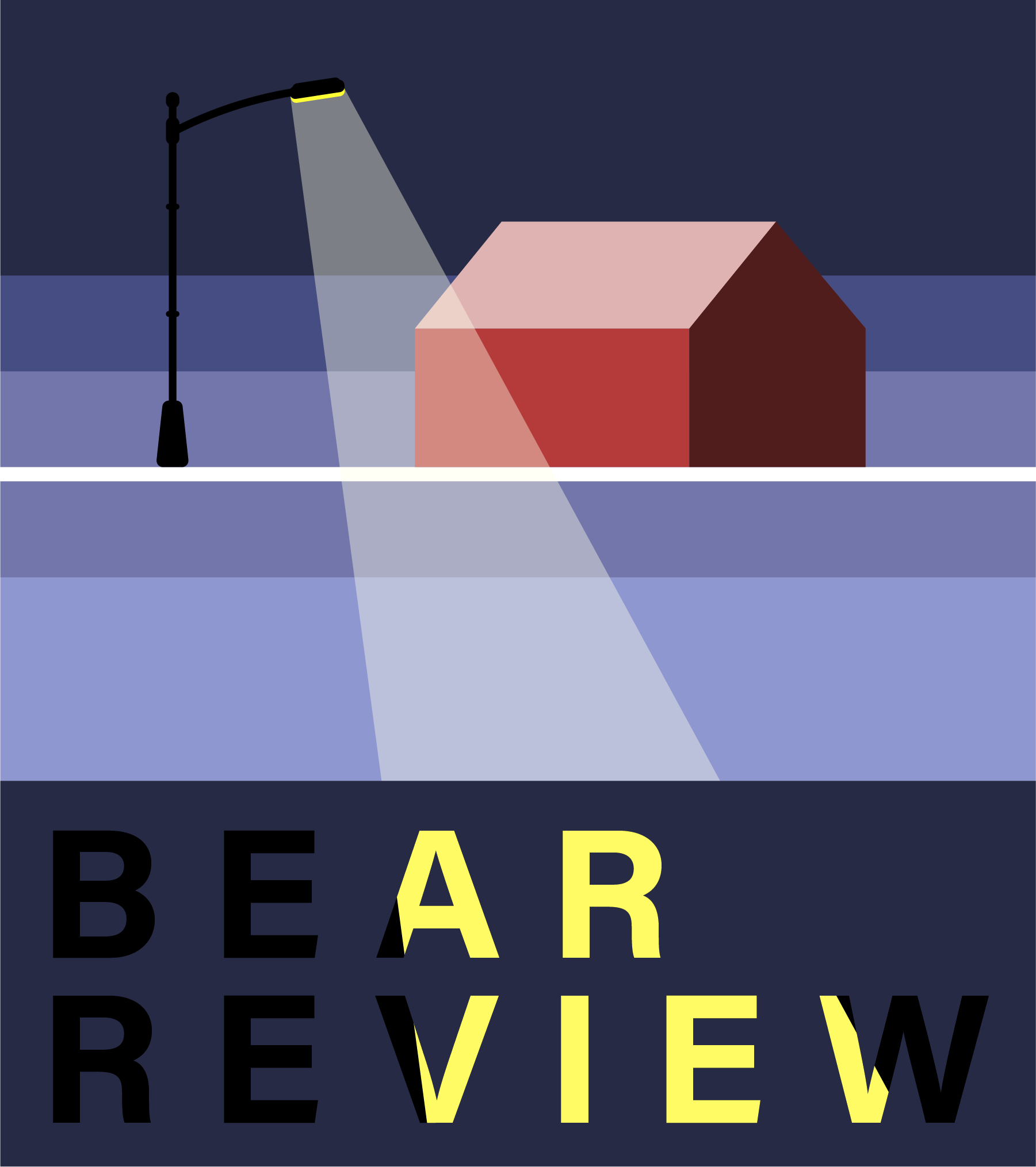
This cover is for issue 8.2. I wanted to do something completely and totally juxtaposed to the 8.1 cover because I like challenging myself to try different things. I remember driving around rural Missouri in the winter of 2021 and seeing a barn surrounded by nothing but snow. I liked the idea of a lonely winter barn, but I needed something to balance out the stark contrast between the reds and blues. So, I asked myself what the most realistic and unrealistic object would be in this scene. A few different things cycled around before I landed on a light pole. I feel it best completed the scene, and it gave me an easy avenue to incorporate "Bear Review" into the design.
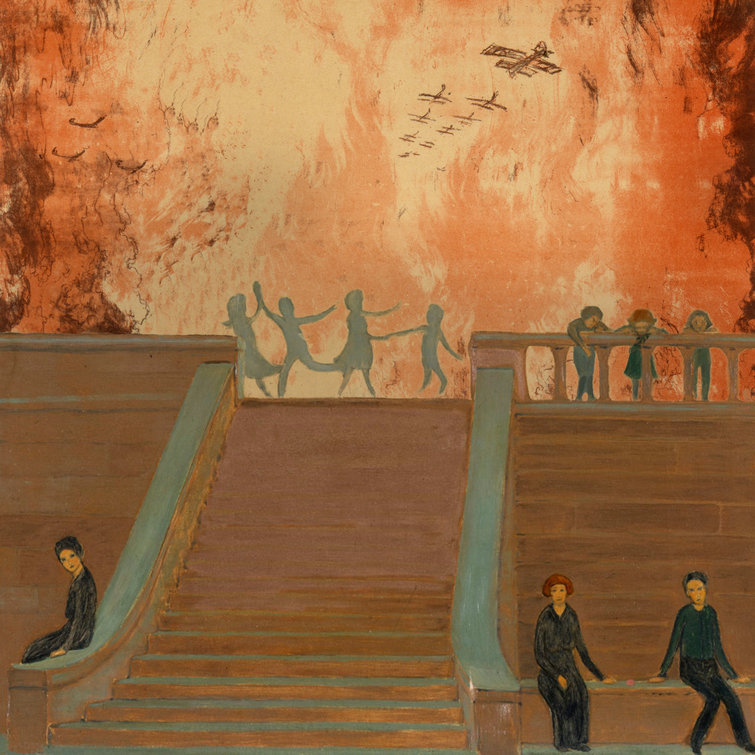
This is the cover for issue 8.1. The editors loved my first cover design for Bear Review. This is a collaged image of two propaganda posters in the public domain. The dancing shadows and the solemn crowd came in one image, and I knew I needed to use it with something. I ended up finding a stocks-and-bonds poster from the Second World War, edited out the Statue of Liberty, and used the firey hellscape as my background. I loved how the warm colors complemented both the wooden architecture and the funeral-garbed foreground folks.