Welcome to what I consider to be my crowning achievements thus far. These book covers are what I've spent the majority of my design career learning for, teaching for, and creating. I've put much of myself into these works, as I do for all my work. Many of these covers reflect phases I went through as a designer, but the surrealist imagery is constant throughout.
The order for the covers goes from newest to oldest. I love to put little secrets or "easter eggs" in these covers – including the logo I made for Laurel Review, references to other artists and their work, and references to my previous work. Many hours go into these, and I am proud of how they all ended up coming out.
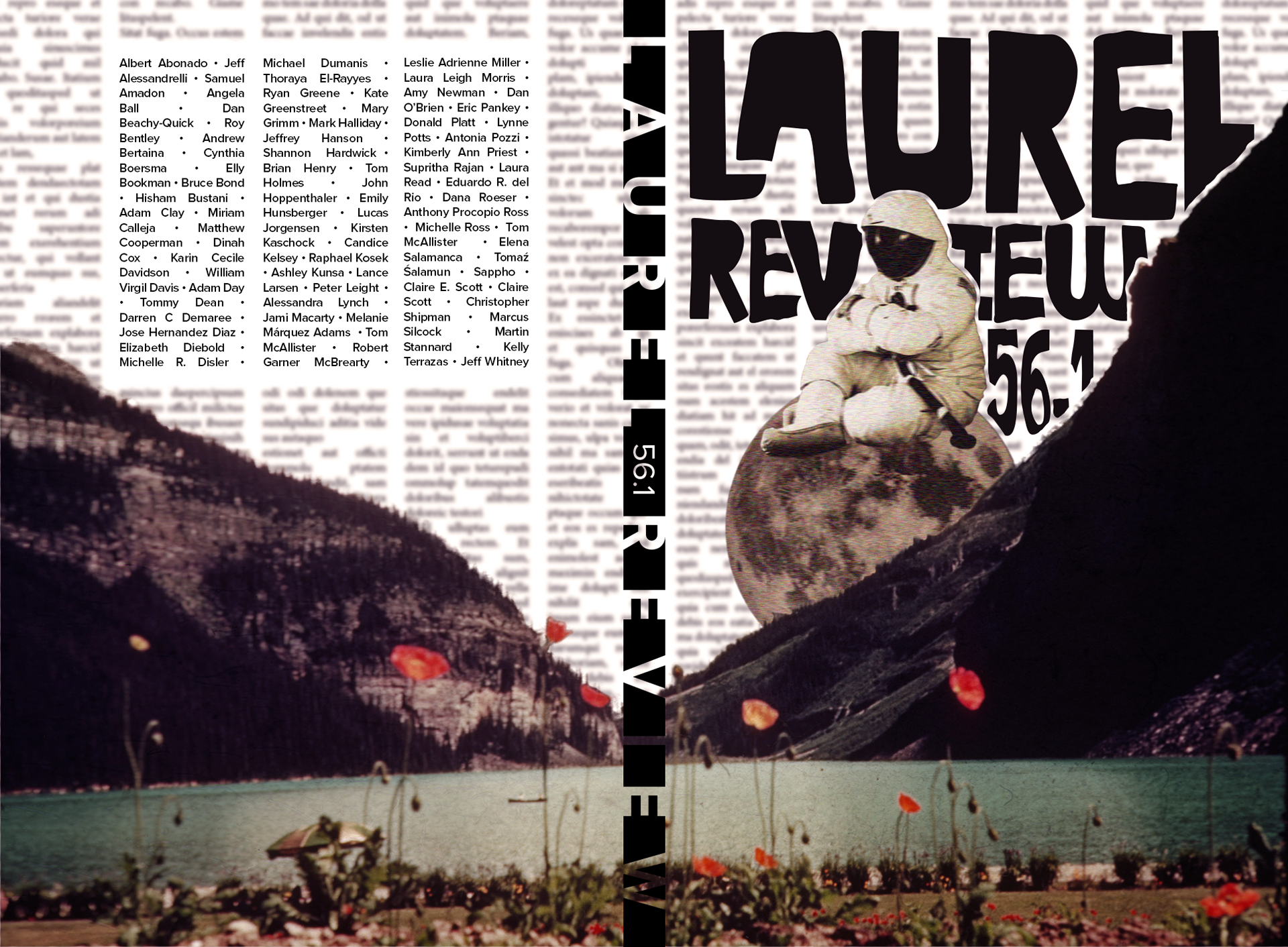
56.2 began as a personal project. This was the final Laurel Review cover I made on my own — my true final cover was a collaborative effort for a very special anthology to come soon. I was given more creative freedom than I had on previous covers, and what came out of that might be my favorite cover. This cover blends the previous two aesthetics for me; I borrowed the gloomy grays and splashed in some blurry red flowers to pop out of the mountainscape. The sad or pouty "moonman", as I called him, riding in on the moon in front of a blurred-out newspaper carries heavy symbolism for me (that I won't divulge here so as not to taint your viewing).
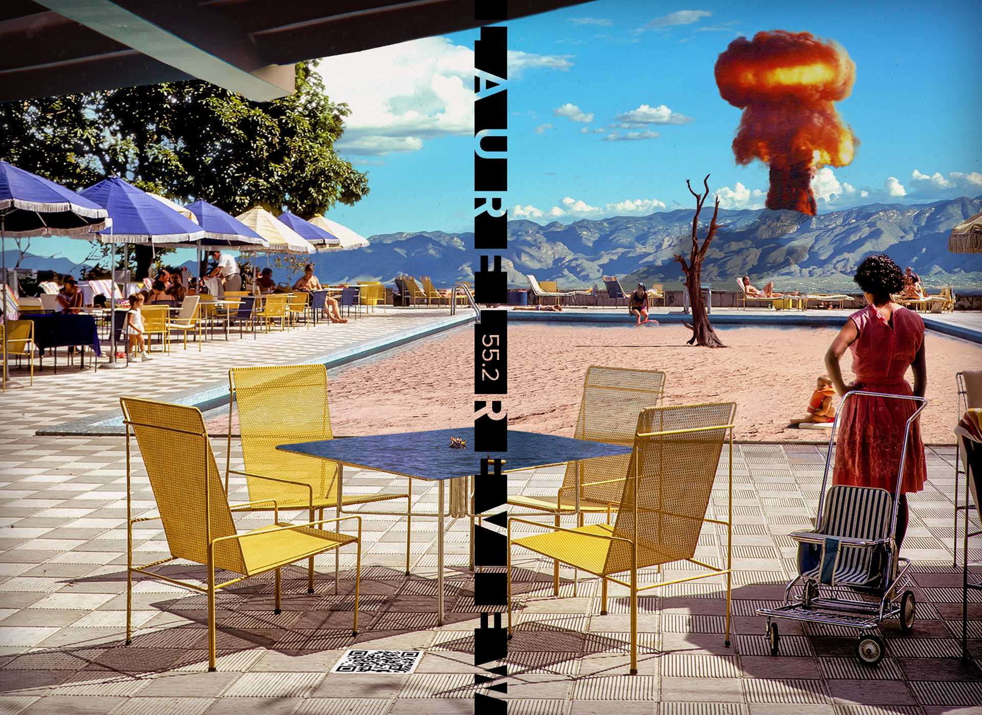
The cover for 55.2 was another digital collage for personal use, but my coworkers and bosses loved it so much that I ended up using it as the cover for this issue. After the gray and solemn cover of 54.2, I wanted to do more with bright and lively colors without completely abandoning my personal style. Despite the assorted oddities, this is probably my most realistic cover image. This, to me, signifies a switch in my artistic aesthetic from pure surrealism for the sake of surrealism to realistic surrealism more in line with Franz Kafka's Metamorphosis.
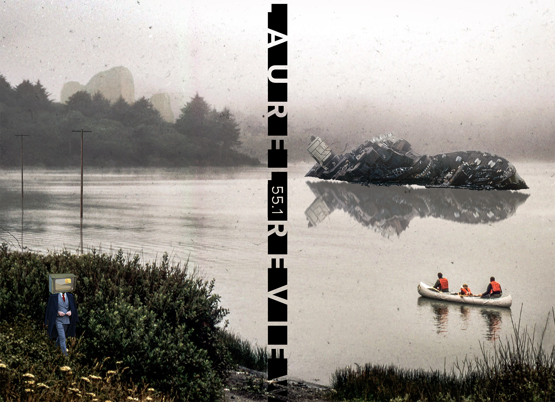
I wanted to explore a full-image cover wrapped from the back to the front with issue 55.1. Of course, I had more or less done that with previous issues, but I wanted to draw more focus to the complete image instead of other elements. As a result of that desire, this was my first issue that did not include the contributor names on the back. This image is also my attempt to parody Landscape with the Fall of Icarus by Peter Bruegel the Elder.
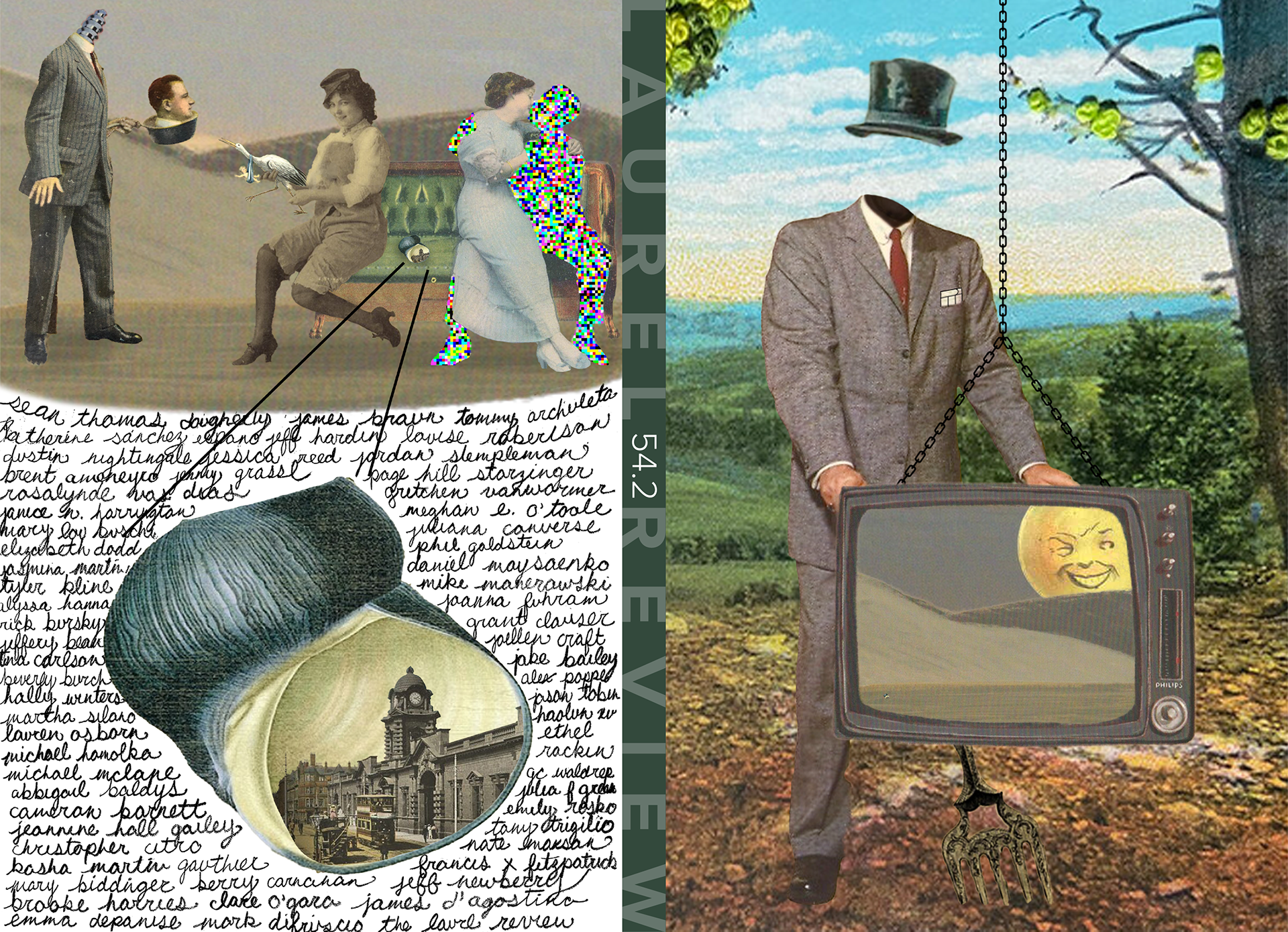
The cover for issue 54.2 was where I really took a deep interest in surrealism and intentionally wove it into the covers I designed. The other covers have, as the office likes to call it, "accidental surrealism", but this was very intentional. As a technical piece, this cover was primarily about honing my craft in Photoshop with masks and layering. The calligraphy on the back cover was not done by me but instead by an intern.
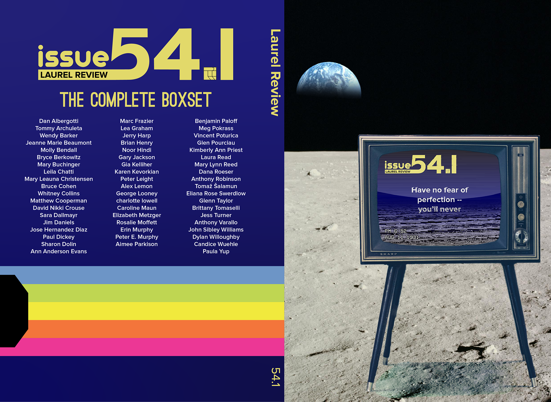
I was going through a vintage, analog phase while designing the cover for issue 54.1. As you can see, much of the inspiration for this cover is from VHS boxes and the tapes themselves. I spent a considerable amount of time learning how to accurately design the VHS time stamps, static, and glare shown on the TV. Then, with my ever-present fascination with space and surreal imagery, I put the TV on the moon.
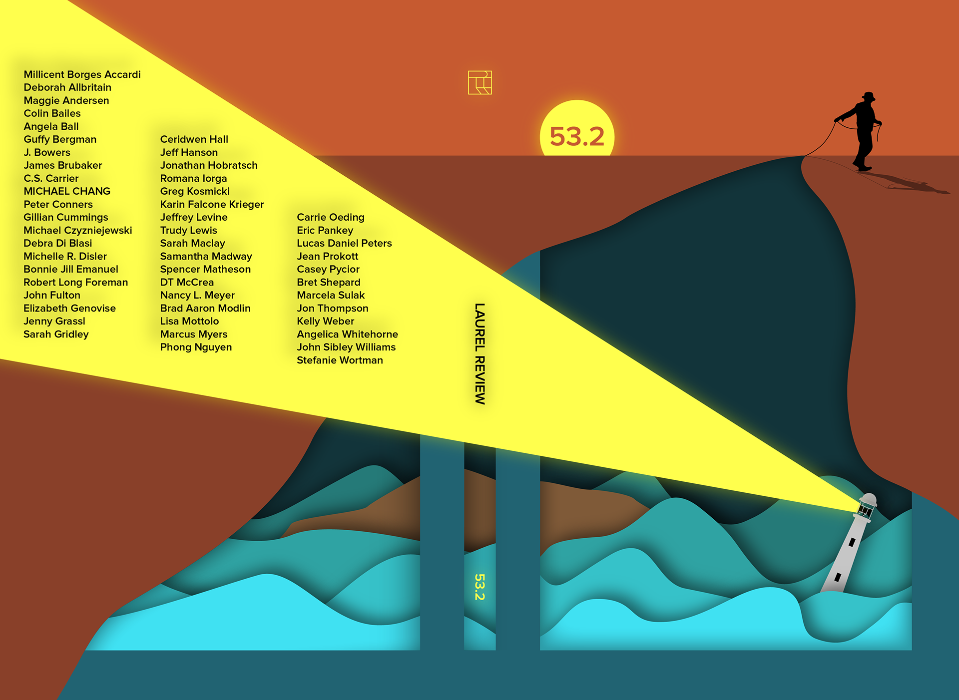
53.2 is a cover for which I spent a lot of time learning specific Photoshop and Illustrator tools. For example, I learned how to create and match the cowboy's shadow with the placement of the sun, and I used the Pathfinder tool to create my little marionette scape.
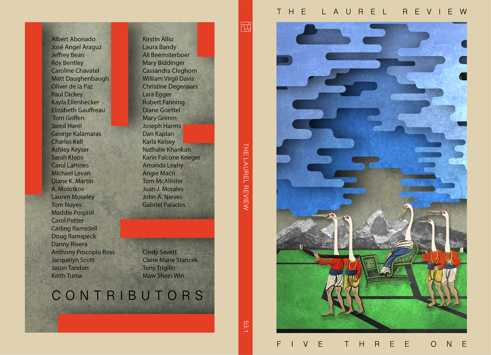
This cover is a favorite of many I have talked to. 53.1 is inspired in part by the album cover for Hot Flash Heat Wave's Neapolitan and by a poster in my editor's office featuring a swan-ballet dancer. The "Disappointed Crane King" cover, as I like to call it, showed me how easy it can be to get a general concept created but how difficult it can be to settle on the fine details. I spent weeks going back and forth with my editors on the specific blues of the sky and the color of the flooring/ground. Eventually, we came to the final cover you see here, and we are all happy with how it turned out.
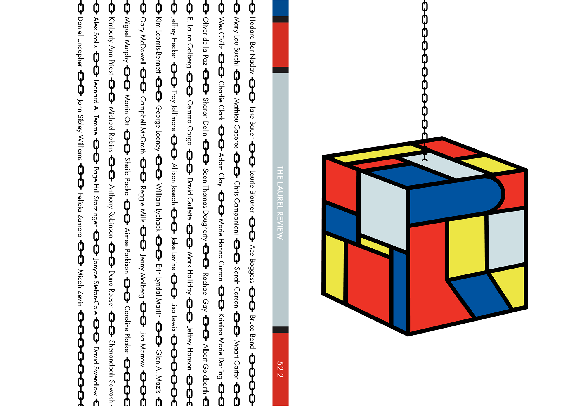
52,.2 is the first issue I did completely on my own. It was also the first time I took considerable inspiration from outside sources. At the time, I was very interested in the art of Piet Mondrian, and it shows in this cover. I'm not sure why I chose the cube-on-a-chain approach, but it turned out to be a good decision. Most literary journals do not omit the name or issue number of their journal from the cover, so it was fun to buck that trend in my first semester as the lead designer.
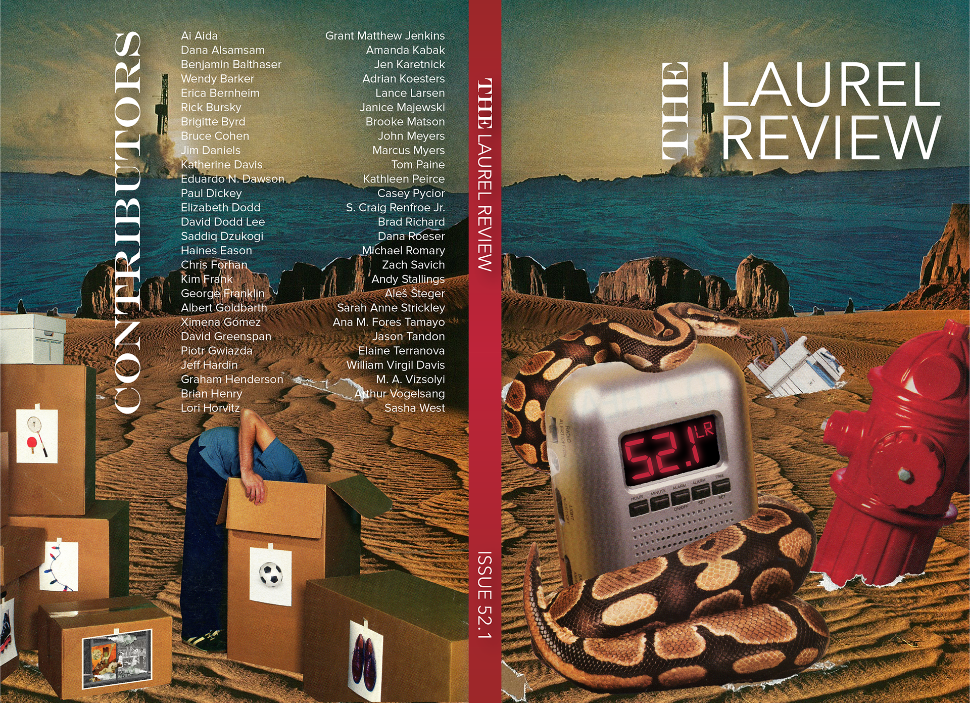
52.1 is the first issue I helped to design. The previous designer and I worked on this cover during the fall 2018 semester. I did not have any general direction I was hoping to go with the cover; he did and does physical paper collages, so he had several pieces cut out. He and I combined to put multiple ideas together before settling on this one. Looking back many years removed from this cover, there are choices I wish I could change about the cover (chiefly the typeface choices), but I have that feeling about most of the issues I designed.